RELEASE
2022.02.19 NEWS RELEASE
Why Has the Number of Newly Infected Fallen?
Since January 25, 2022, CATs-QUICK has been providing a dynamic forecast for the 7 day moving average for the number of newly infected in Tokyo (The first forecast release was on January 24, but the first forecast with the projected peak date started on the 25th.) Our projected peak date was Feb 1 to 9, and the actual peak date was Feb 8.
*CATs (Collective Analysis Teams, [formerly Collective Analysis Tracking System]) is a team of private sector volunteers providing research, analysis, and policy proposals aiming to achieve the optimum between tackling COVID-19 infection while minimizing social and economic damage. The team’s expertise lies in social science, big data analysis, and AI. In a partnership with information vendor QUICK Co., Ltd. (Headquarters: Chuo, Tokyo, President & CEO: Shinzo TAKAMI), we provide live data analysis to society. In the past CATs cooperated with Keidanren (Japan Business Federation) and provided the JR East passengers data analysis in their policy proposals presented in last autumn. CATs-QUICK forecast is now referred to by the media and various public and private institutions including the Keizai Doyukai (see Chairman Kengo SAKURADA’s press conference in Feb. 16).
Various research teams have attempted to make predictions based on different simulation methodologies for the sixth wave of the novel coronavirus, Omicron variant. Each team update their models at different schedules, but the CATs-QUICK forecast is the only dynamic forecast which is updated daily based on the latest data. Figure 1 shows predictions made by late January (Jan. 24). As you see, the predicted peak dates as well as the numbers infected differ substantially.
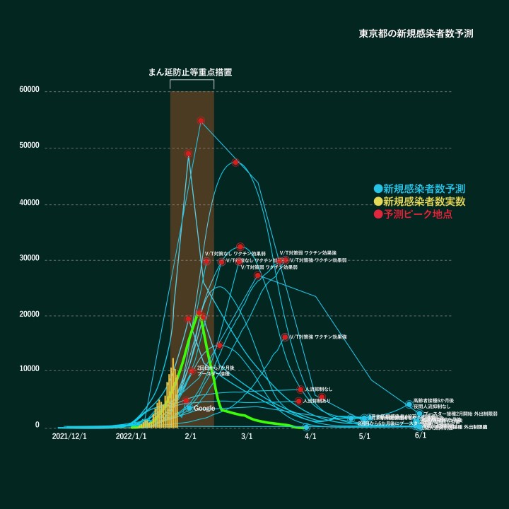
Figure 1 Various predictions made by different research groups by Jan. 24, 2022.
The 7 day moving average of the newly infected in Tokyo peaked on Feb. 8 and is continuously decreasing since. CATs-QUICK judges the current phase as the early stage of “Decreasing Phase”, and conclude that “the peak was REAL” on Feb. 12. During the previous 5 waves, we did not see a reversal once a phase had shifted. CATs-QUICK projected that the peak date of the 7 day moving average was between Feb. 1 to 9 from the beginning of our forecast, but the height of the peak was actually lower by 3,000. Everyday, CATs-QUICK takes in new data such as traffic volume, SNS, internet search, and overseas data in our model, and dynamically revises the forecast. From Jan. 31, we forecasted the downward trend of patients for the sixth wave will be gradual, and the projected shape of the wave has not changed much since. The importance of the dynamic forecast is to be able to predict more accurately as time goes by. It stands out when compared with the other models. For example, Japanese government adopted a certain model which predicts the demand level of the medical care for the covid-19 patient from November 2021, but the forecast stopped on Feb. 1, one week before the peak in Tokyo, since the model could not predict the demand accurately. The same has happened to other models, except CATs-QUICK and AI prediction by Prof. Hirata (see the left graph in below Figure 2).
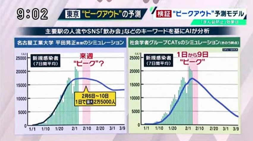
Figure 2: From the TV program “Wake-Up” broadcasted on Feb. 5 (Prof. Hirata’s forecast is on the left, the CATs-QUICK forecast on the right.)
Since the current trend is in line with the forecast presented by CATs-QUICK, we have received questions from media on WHY we were able to provide such a forecast. We decided to write out some comments on the frequently asked questions. “Why has the number of newly infected fallen?” “Why is CATs-QUICK able to provide predictions consistent with reality?” As the experts repeatedly point out, the spread and convergence of COVID-19 is based on multiple factors, and the impact it has on society is complex, it is difficult to give a straight answer, but the bellow is our attempt to do so.
Chairman Omi of the government’s novel coronavirus infection control subcommittee said the reason for the convergence of the fifth wave was complex, after he finally admitted that the peak had passed in mid of September 2021. That was 3 weeks after the actual peak, and the infection level was about 20% of the peak. A wide range of explanations were provided through the media. Some emphasized, “because they tightened their masks”, others mentioned that “the behavior of young people had changed”, or that “the effect of the vaccine” was critical. There seemed to be a consensus that there was NO consensus. Experts thought there were multiple factors as Omi said, however, it is probably impossible to establish exactly why.
Decrease in the number of newly infected after the peak of the fifth wave could not be explained by either vaccines or “people flow”, i.e. the number of people in public. This strongly suggests that experts do not know all of the factors. For arguments’ sake, let’s say that 20% of the elements are known and 80% are not. It is impossible to make accurate predictions with only 20% of the data.
So why was CATs-QUICK able to predict the peak of the sixth wave? The Short answer is that we combined big data analysis with machine learning. There are many types of AI; advanced AI that “learns too much” by focusing on details, or AI that is not as capable but is better at finding rough patterns. The key is to read patterns by experimenting with all kinds of methodologies, rather than relying on the “few things we already think we know” to help control infections and being dragged towards a certain hypothesis.
Reading patterns does not mean to simply mimic the shape of an overseas Omicron wave, or simply extending the existing trend line. This would be close to just saying “because I think so.” However, human intuitions, of course, is an important factor, and machine learning resembles somewhat those intuitions that is comprised of reading patterns that are very important. The difference is that we take in enormous amounts of big data, and simulate again and again based on different scenarios. Throughout this process, we begin to understand which factors are critical and others that are not. This is the basic principles of the analysis by CATs.
One of CATs’ uniqueness is introducing behavioral change indicator, which bounds hundreds of individual indicators. People flow is sometimes visible, but human behaviors are not, until now. For example, one can easily imagine that when you work from home, you would ask for delivery or Uber Eats. However, we can visualize some data which seem to be unrelated at first glance. When people become nervous about the infection, the key-word like “masks” and “covid-19 symptom” naturally increase in internet search, but so does searches for “interiors.” When you stay home, your attention turns to things in your house and you might want to spend money there.
The image of the psychological cycle is shown in CATs-QUICK’s daily prediction (Figure 3, the colored circles represent Optimism (pale green), Fear (yellow), Panic (orange), Despair (Red), Hope (Blue), Comfort (pale blue), Outlook (Green), Oblivion (beige)), which is the outcome of the quantitative analysis of people’s feelings in internet and SNS. Behavioral change indicators include, for example, the Fear Index. In the down trend, the index of “covid-19 restriction fatigue” increase significantly. Depending on how much you quantify and analyze these “soft” factors, you can see things that are hard to see.
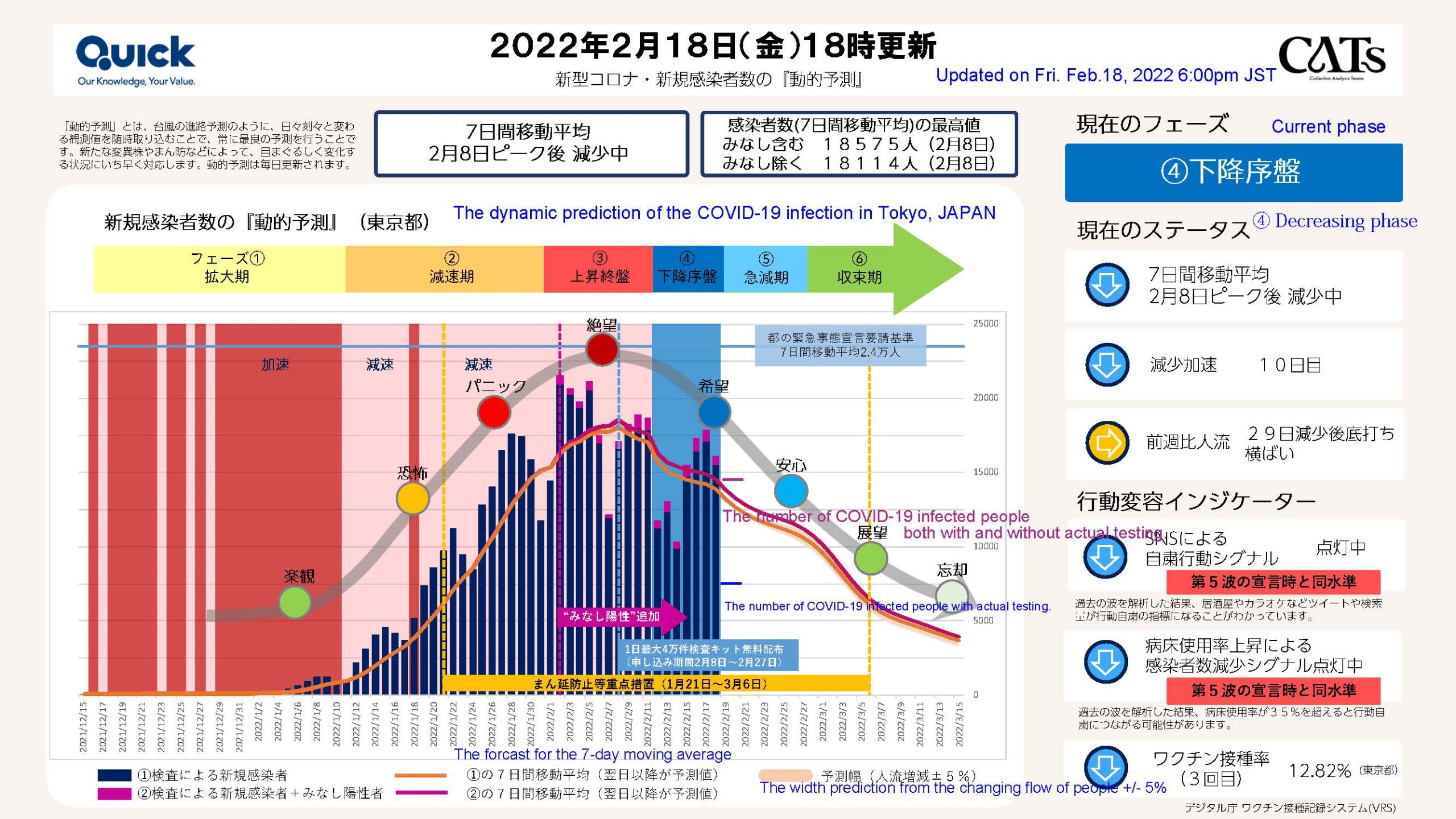
Figure 3 CATs-QUICK dynamic forecast on Feb. 18.
People’s behavior is complex, and people’s relationships and contacts in society vary widely. The density of the population of the city and the structure of the city differs, and demographics such as the aging population ratio also have an impact. However, it is difficult to make predictions by making carefully crafted hypotheses for each of them. Why?
That’s because the real world is a more complex system, no matter how much theoretical refinement you try at this moment. It is worthwhile to invest and promote strictly academic research, but you don’t apply purely theoretical economic model into day-to-day decision making. The dynamic forecast by combination of big data analysis and machine learning can make more realistic short to mid-term predictions by keeping track of changing data every day and even every hour (for example, railway company use this kind of big data analysis every day to prevent accidents).
In order to take this approach in time of emergency, it is important to collect a wide variety of big data, and to update the predictions by inputting new and updated people’s behavior into the models. One of the most important initiatives of CATs is collaborating with key private sector companies which have a wide variety of proprietary data, which unfortunately has not been utilized in public policy decision making in Japan.
We have discovered various findings through the process of making forecasts. For example, CATs’ analysis of past waves shows that human flow has certain effect on the height of the wave when the numbers of newly infected are increasing. However, human flow does not have much effect on the speed or pace in the decreasing phase. In autumn 2021, when there were no waves, no variant, the number of newly infected people did not increase no matter how much the human flow recovered. The medical experts expressed concern about school activities after the summer break, but the infection did not spread from children who had not even received the vaccine. As of last autumn, there was not much correlation between human flow and reproduction number of covid-19. It is a task of academic researchers to study this phenomenon further, but the bottom line is that “human flow does not always have an equal impact,” “but it effects the height of the peak of infection”.
We think the key for success is using as much big data as you can, letting multiple AIs learn those data, and updating forecast with multiple models every day. At the same time, we shouldn’t forget the side effects from infection control. CATs’ task is not limited to the forecast for the level of the infection. That is only the beginning of our project. We do not overlook what damage has been done as a result of certain policies. What can we learn from past 6 waves to minimize social and economic damage? This kind of analysis will be required for future measures in fighting infectious diseases.
AI and big data are not fortune tellers. They don’t predict future. They tell us certain trend for the future one step ahead in an emergency where time is crucial. We, humans, don’t know everything. The key to success is this acknowledgement of the unknown, yet still make decisions with the best possible information at your disposal.